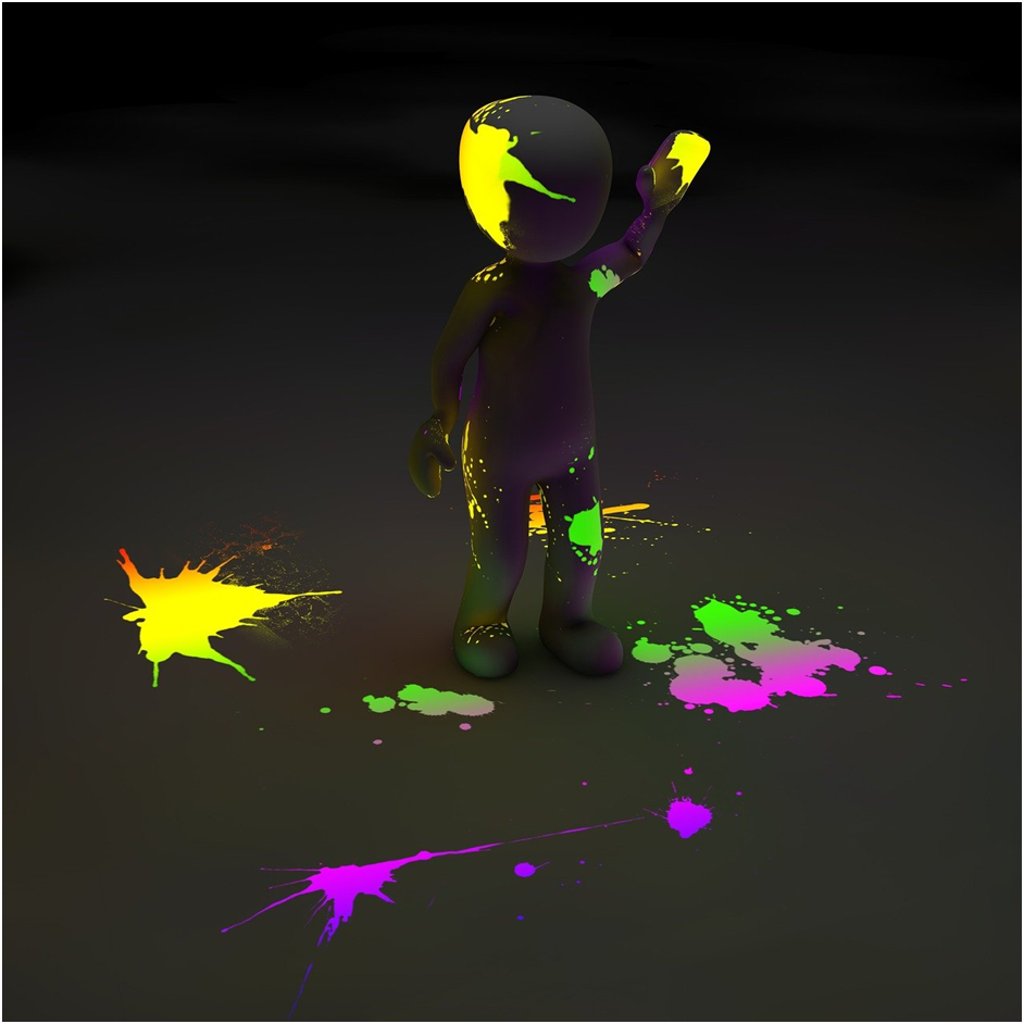
When it comes to design, the color spectrum is one of the most important aspects you need to take into account. Different colors are apt for different kinds of designs and when you apply them in the right way, they can have a profound effect on how your audience perceives your content. Neon colors are some of the most interesting in this regard. They’re not only easy to incorporate into designs but also very powerful because no matter what kind of message you’re trying to convey, they can help people instantly understand it. That’s why we want to share with you 5 ways on how you can use neon colors in your next design projects.
Add Connotation to Your Designs
Neon colors are great for adding connotation to your designs because they have a certain vibe that other colors simply don’t have. Neon colors are usually intense, vivid and exciting. At the same time, they stand out because of their boldness. That’s why, when you use them, you want to keep in mind that you’re adding a certain attitude to your work. This is especially important when you want to add a connotation to designs related to a specific topic or industry. For example, neon colors can help you convey the excitement of the travel industry or the adventurousness of the robotics industry. In addition to that, they can also be very useful when you want to add a connotation related to emotions. In that case, you want to make sure to pair neon colors with other shades that convey the same emotion you want to create.
Use Colour Schemes
When you want to incorporate neon colors into your designs, it’s highly recommended that you also include some of the other colours in your palette. In order to make sure that your designs have a certain flow and to make sure that the palette isn’t too chaotic, you want to use some of the other colours in your work. So, instead of focusing on the colours you want to use the most, you can use them as accents in your work. That way, you don’t overwhelm your designs with colour but you’re able to convey the intended message with more ease. If you want to take this concept a step further and make your designs more interesting, you can also use some of the colour schemes that are popular right now. For example, the pastel colour scheme is very popular right now and it’s perfect for adding some extra vibrancy to your work.
Create Contrast and Repetition
One of the reasons why neon colours are so powerful is because they allow you to create contrast and repetition in your designs easily. You see, neon colours are usually very strong and intense, which allows you to add contrast to your designs. When you want to add some texture to your work, neon colours are a great choice. At the same time, they also allow you to create repetition in your work because, once you add them in a certain way, they’re very noticeable. That’s why, once you introduce neon colours in your design, you want to make sure to keep them in a consistent way. That way, you can create repetition in your designs and make them more interesting.
Use a Colour Wheel
One of the biggest benefits of neon colours is that they allow you to explore the universe of colours. As you’re about to see, there are millions of combinations that you can use. That’s why, once you start experimenting with different neon colours, you’re going to see that each one is unique and has a completely different vibe. That’s the best way to understand why you want to use neon colours in your designs. At the same time, it’s also a great way to expand your palette because each colour is unique and useful when you want to create a certain effect. For example, take red. It has a warm vibe and can be used for both warm and cool designs. On the other hand, yellow has a happy vibe and is great for highlighting things that are positive in your designs.
Showcase Iconography
If you want to add some extra power to your designs, you want to make sure to use neon colours. That way, they’re going to stand out and be very noticeable. They’re also great for showcasing iconography, which is a great way to make sure that your designs are easy to understand. Iconography is a visual language that we use to represent words and phrases. It’s a way of communicating ideas that we take for granted every single day. It’s also a great way to make your designs more memorable and understandable. Iconography can be anything from images, shapes, colours, or words, which means you have a lot of options when it comes to designing with it. One of the best ways to incorporate it into your work is by using neon colours.
Don’t be afraid of the unexpected
No matter how many times we tell you about the power of neon colours, you’re probably going to be surprised by it. That’s because neon colours aren’t common and, as such, they can create a very interesting effect on your designs. That’s why, once you start experimenting with different neon colours, you’re probably going to see that they each one is unique and interesting. That’s the best way to make sure that you don’t get bored with the trend. That’s also the best way to make sure that you stay away from the common designs. By doing so, you’re able to create designs that stand out and are very different from others. That’s why, once you start experimenting with different neon colours, you’re definitely going to see that each one is unique and interesting. That’s the best way to make sure that you stay away from the trend.
Conclusion
Neon colours are one of the most interesting and powerful ones in the design world. They can help you create contrast, add connotation to your designs, showcase iconography, and much more. When you want to use them in your work, you want to make sure to incorporate them in a consistent way, create contrast and repetition in your work, use colour schemes, and use a colour wheel, which are some of the best ways to do so.


